UI/UX DESIGN | Entertainment | Events
Implemented a chatroom to discover venues to see
Team
Me
2024
ROLE
UX/UI Designer
Tools
Figma, Maze, Zoom


Project Overview
Ambi is a lifestyle app where users can discover the best fun events and dine-out experiences at exquisite restaurants in their area.
Once they find a great place, they can communicate and plan with their friends and loved ones to share the best experience all in one app.
Problem
Multiple apps can be overwhelming with event planning, invitations, finding events, and messaging friends.
Overall, it can be a hassle to use multiple apps, social media, and browsers to find events and restaurants. Sometimes, users chat through DM or text to share and send to friends. Sometimes, people forget about events and who's going. Why not have them all in one?
Solution
Users can communicate and plan their day or night after finding venues and restaurants with friends and family.
I created an end-to-end app for users to find events in their local area or city and then chat with friends or family to have a great time. This app also includes:
RSVP/ poll options to know who's attending or not
Set a reminder for events is happening in your area
RESEARCH: CompetitIve Analysis
What other sources do people find events to share and how do they communicate with each other?
Those are the questions I had to ask myself during the insight research process. I conducted a competitive analysis of other lifestyle event apps to evaluate their products for strengths and weaknesses. Therefore, I can identify a strategy for how to lay out the design, what features to add, and other innovations to provide for our users.
Key findings are confidently explored and experience to connect in their area or the city.
User Interviews and Surveys
Empathize with people who like to go out and plan the day or night
I've conducted remote interviews with 3 participants and surveyed 7 participants within the age group of 24-31, women and men to understand their relationship with looking for new places to explore and how they communicate.
During interviews, I want to know the common themes by focusing on communicating, planning, and finding new places with friends and family. (bullet points format 2 columns, bullet points one side or both, simple easy to consume)
Participants falls under these categories:
Organize individual
Spontaneous individual
Communicate by text/DM
Currently uses social media to find events
Currently uses event planning app

Common themes from the Affinity Map
Too many apps for me to use to send invites to friends
RSVP function to know who’s attending
Personas
Let's design for spontaneously social butterfly and organize introvert nerd


How Might We
How can we assist users in creating a better experience for finding cool venues to send invites to friends and family, whether they plan ahead of time or spontaneously?
Design Goal #1
Ensure users they can easily share invites each other
Design Goal #2
Keep up with date nights and hang outs
Design Goal #3
Plan the ahead with friends in one app
iDEATE
Outlining the user journey and paving the way for usability testing
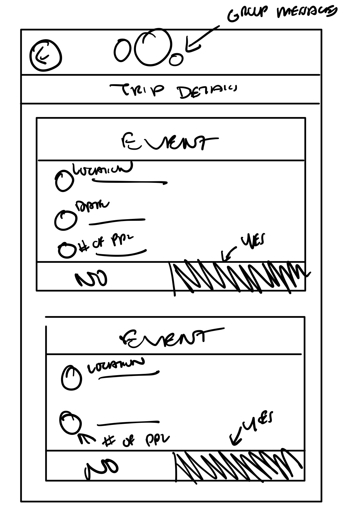
I arranged a user flow to provide a visual representation of how users would navigate through the product. The user flows from messaging with people and ordering tickets to completion.

Product Roadmap
Prioritize potential features based on user research
After the research and interviews, I brainstormed potential features that should be included in the design. I prioritized the must-have features that will have the largest user impact with the lowest effort required. I bolded the features I want to have and the stars are the important features to show based on the user research.
⭐️ Stars are the important features to show based on the user research.
Design Inspirations
Gaining insights from successful design ui patterns and features
Before I began drafting the wireframes, I needed to look for design inspiration wherever I imagined this project. In terms of design patterns, layouts, and color, I viewed other event apps, texting apps, and movie apps to see how other UI designs for this project were executed.


Sketch to Screen
Sketch ideas to mid-fidelity designs
Brainstorming solid foundations of Ambi functionalities and essential design elements based on inspiration from other UI designs from mobile apps. I came up with a few rough sketch ideas and made some adjustments to transform them into mid-fidelity wireframes.
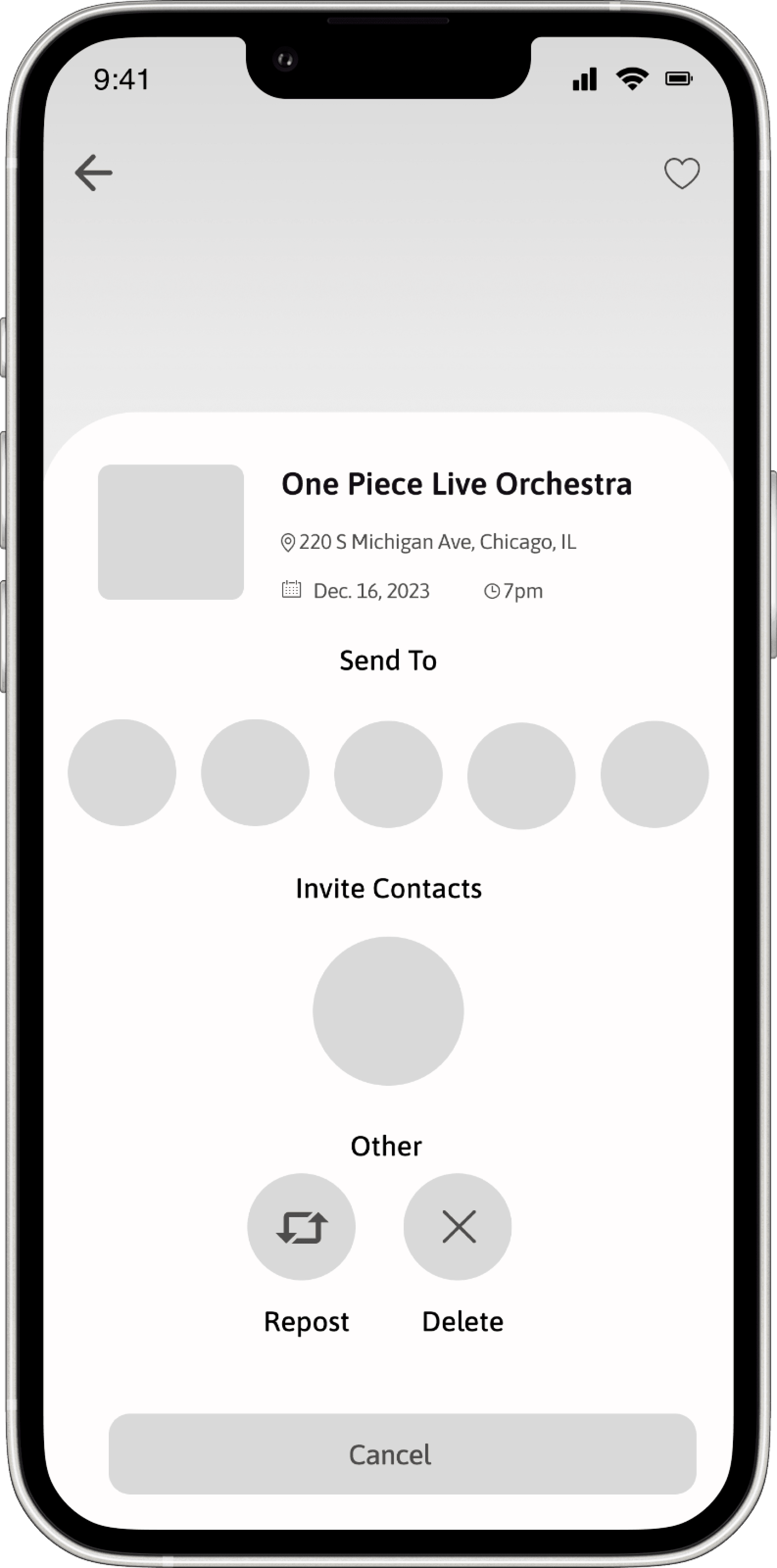
Event Screen
❗️Opportunity
✔️Feature
Sharing feature will to any
individuals or group messages easily without going to other apps
Message Screen
❗️Opportunity
✔️Feature
"Being able to communicate with my group of friends and family on one platform would make planning easier"
You can message anyone to schedule your day or night. There is a banner that displays the messages, polls, and schedule. Users can check their availability by viewing the RSVP, polls, and schedule


RSVP Screen
❗️Opportunity
✔️Feature

❗️Opportunity
Reminder Screen
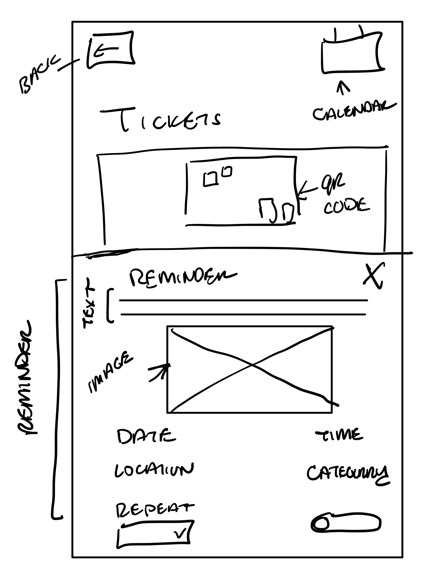

Mid-Fidelity Flow
Mid-fidelity screens for usability testing
Here is the entire mid-fidelity flow. I've added some screens to complete the flow so that testing feels complete.

Design
Designing a fun, warm, bubbly visuals for this app
I wanted the logo to be fun, warm, and bubbly, with a color gradient. I'd like to choose a name
that captures the vibe of attending events with loved ones. Ambi is derived from the word "ambiance," which refers to the desire for a pleasant environment to create memories or attract repeat customers.
Sketch Designs

Final Design
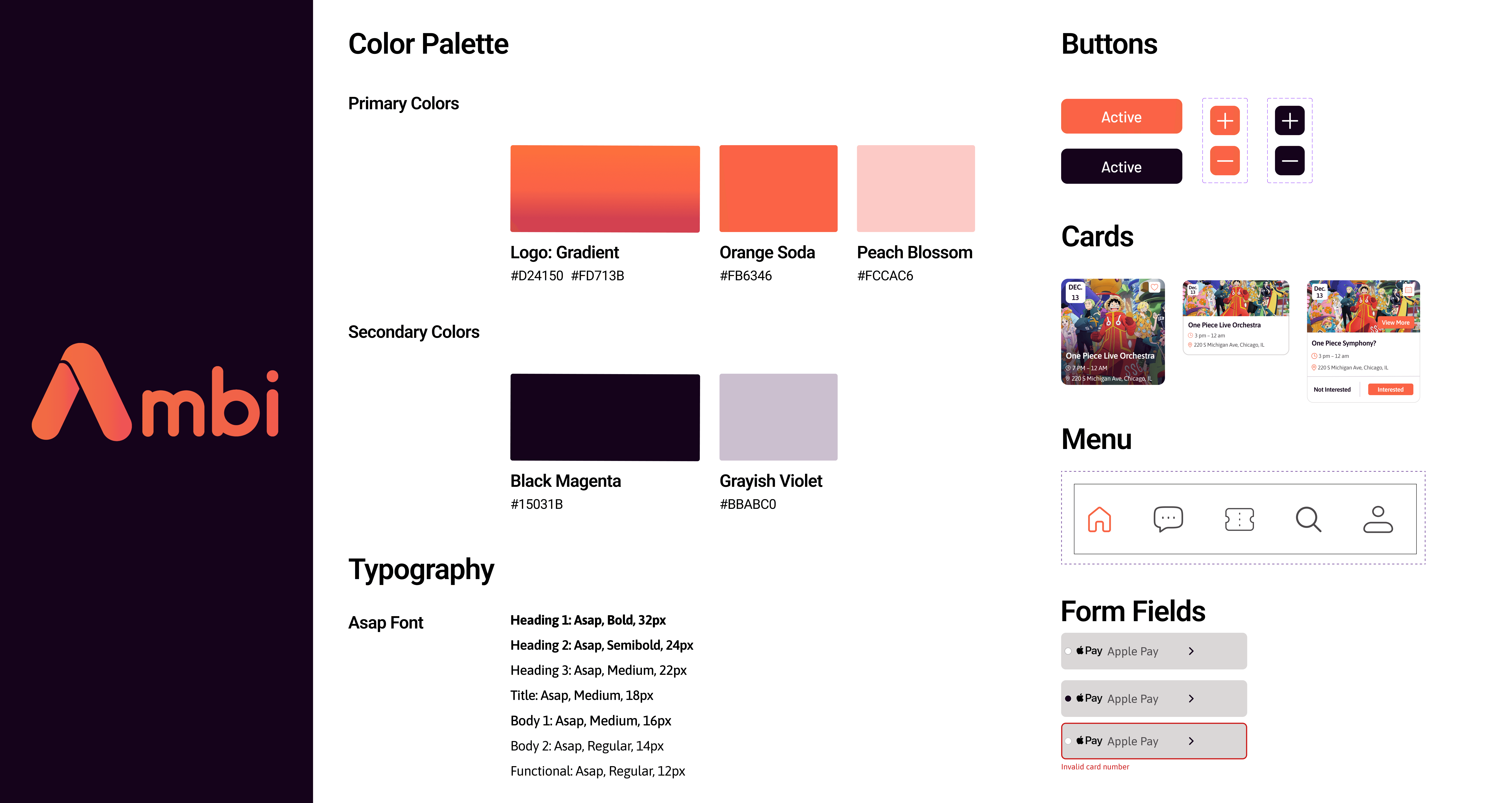
Brand
Creating a warmth, fun energy brand for Ambi
The primary color is orange because it represents warmth, energy, and happiness. I also want a gradient with a red/pink-orange shade. I want users to open this app feeling energized and ready to choose a fun place to visit with their loved ones.
Usability Testing
A round of usability testing and the users have some notes…
I've tested users with a 7 participants to gather feedback and impressions. The usability test focused on their valuable experiences and use of the features.
These are the questions I asked during the usability testing:
How often do you look for events to attend on any app, social media, or search engine?
How would that benefit you as a user compared to the events app you've used?
What do you dislike and like about these tasks?
Were all the tasks easy to understand and finish?
Is there any feedback you would like to say of your overall experience of Ambi?
Tasks during the usability testing
Share an event and message with friends
Create a poll to RSVP
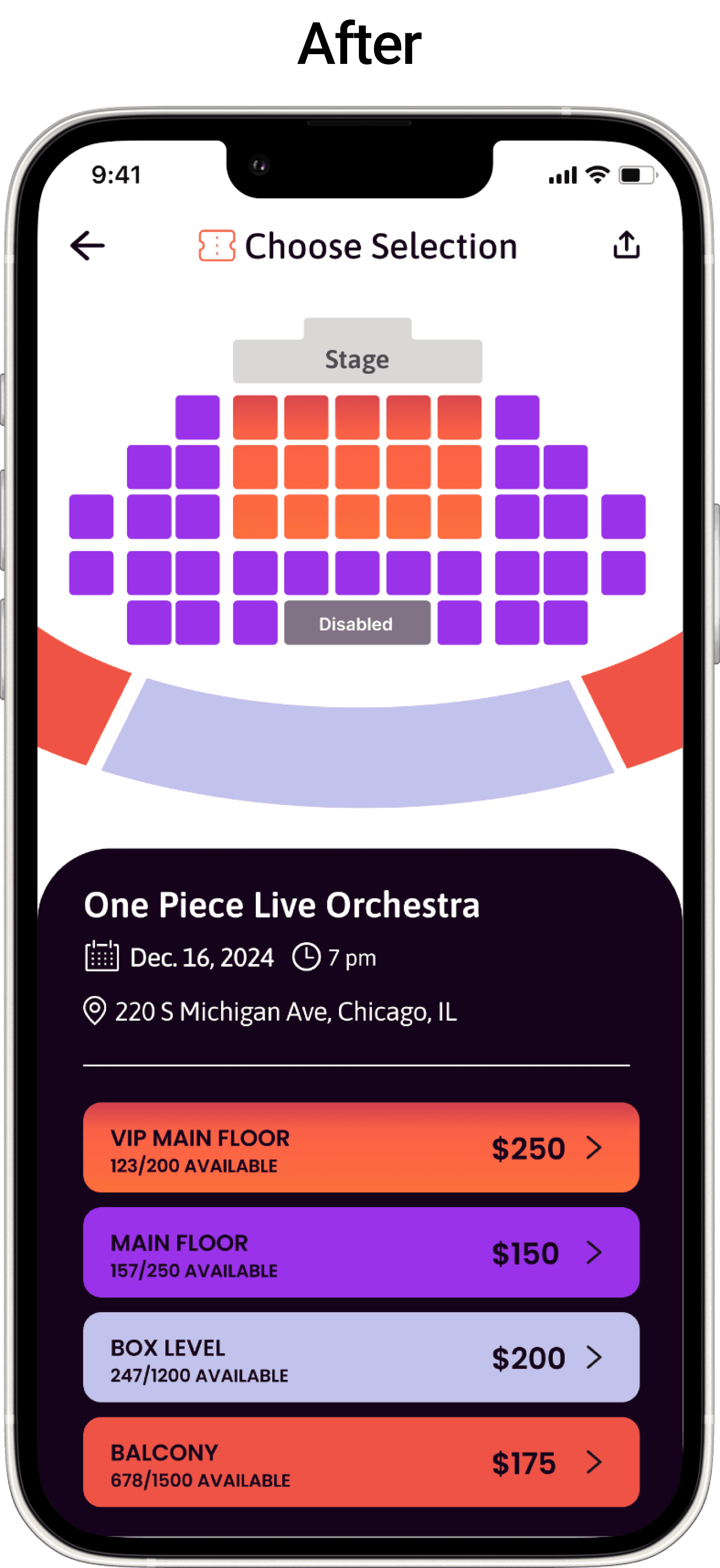
Select seats and purchasing tickets
90%
Time Completion
5 mins
Errors
9
Feedback from participants
Participant 1
"I would like for reminder confirmation.
Also fix the prices to purchase the tickets it's the
same price."
Participant 2
"I got confused when I bought the tickets and didn't realize that I had to set a reminder for myself. I enjoyed the app though!"
Participant 3
“Overall the app is good and looks really nice and easy to follow."
Here are some critical adjustments to the final designs


FINAL
Prototype of the final design
Users can communicate and plan their day or night after finding venues and restaurants with friends and family on this end-to-end app. This app also includes:
RSVP/ poll options to know who's attending or not
Set a reminder of when and where the event is happening in your area
Final Thoughts
What I've learned…
I'm delighted with the feedback from my peers during the low-fidelity phase because there were a few screens that needed to be reiterated before the high-fidelity. It's a great lesson to see how the competitors, Eventbrite and Fever layout design and what I can do differently.
Do Differently…
What I would have done differently was add a screen to showcase the friend's schedule and to see how it functions. Plus add another screen of a public forum for people to find new friends.