Ani | Social Media Platform

Created guest experience to boost user engagement

Team

2 other Product
Designers, 1 Developer
Startup Founder

2 other Product Designers,
1 Developer and a
Startup Founder

2 other Product
Designers, 1 Developer,
Startup Founder

YEAR

2024

ROLE

Product Design Intern

Tools

Figma, Slack, Figjam

Weather app image
Weather app image
Weather app image
Weather app image
Weather app image
Weather app image
Weather app image
Project Overview

Ani is a startup company of social media platform for building a connection for anime fans to share their interests with each other.

I worked with a team with amazing designers and we were tasked to create a preview experience of the app for new users alongside redesigning the account creation flow. For this case study, I will keep it brief and show the preview experience.


Problem

Improving and redesigning the social media platform mobile application to reach anime fans everywhere. 

Without an existing account, users are currently unable to browse the app and try it out to see whether they are interested in what Ani has to offer which leads to 32% drop-off rate during onboarding. This represents a missed opportunity for us to capture individuals and connect them with the app, ultimately converting an exploring guest into a signed-up user.

Solution

We planned for an element to be included into features to prevent access to sections that require an account.

We also want to give allowance for the users to explore the app to the extent that they might be interested in signing up. The copy and content of the elements would alter in accordance with the feature, telling users of the advantages of registering for a free account and offering them a call to action to become a part of the Ani community.

RESEARCH

The team and I consider providing existing applications ideas to the guests preview experience

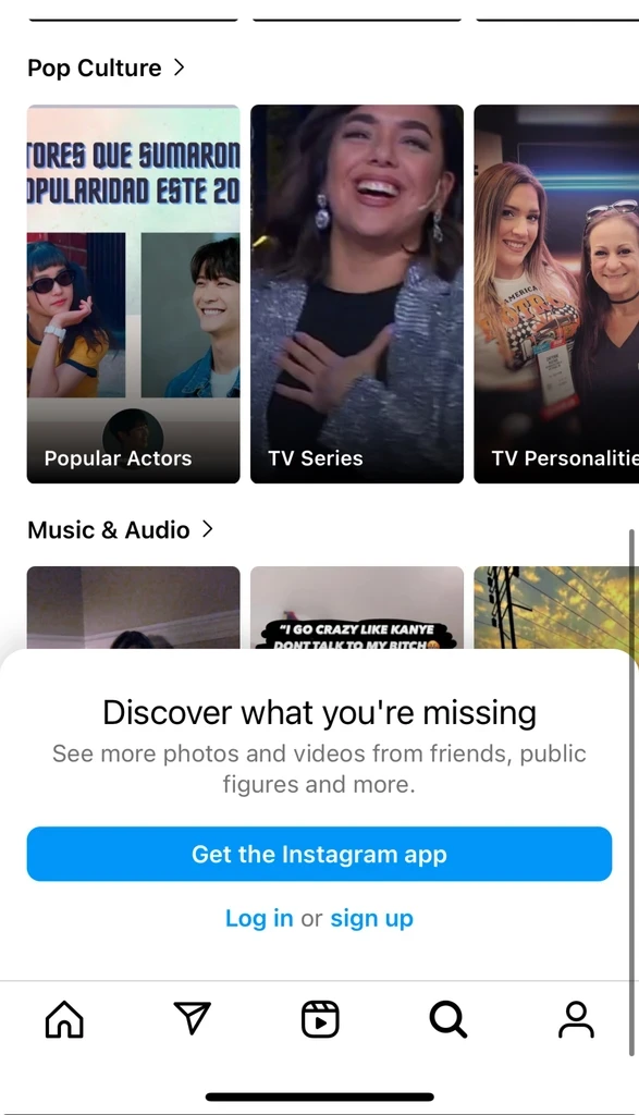
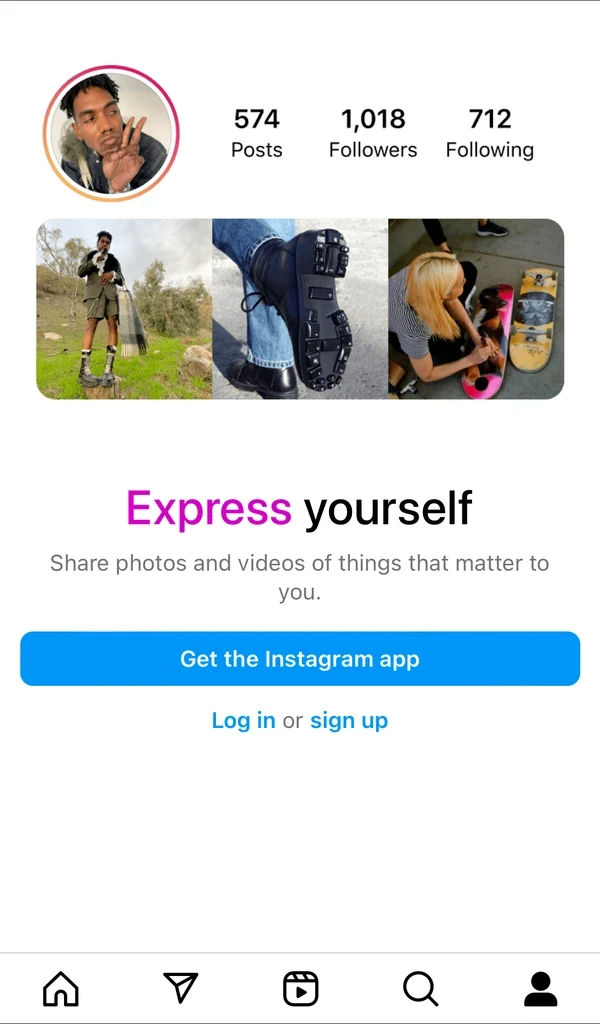
Social media platforms offered limited viewing experience before committing creating an account. We viewed other applications like IMDB, Instagram, and Quora to identity how other applications design a prompt to sign up their account.

Outside of the design elements, we thought how we should introduce this new element into the existing architecture of the app. Some questions we asked each other to help support our final decisions to where we should implemented included:

  • At what part of the user flow do we abrupt the guest exploration?

  • What areas of the application that require access?

  • Will guests be allowed to interact with posts, articles and similar features by liking, reposting, commenting, and saving?

Our Findings/Ideate

We all shared our findings based on design inspiration from other apps for this project before designing the mockups. 

We all shared our pros and cons from each applications. We noticed social media applications kept similar paths of guest exploration until the guest user is require to have an account.

Instagram took a persuading approach towards users to sign up by tailoring to their features and what a user can expect from using Instagram

How are we going to persuade users to sign up from different pages and interactive points in this application?

Design Goal #1

Ensure users they can easily create an account anytime.

Design Goal #2

Allow for some exploration for users to create a decision to sign up.

Design Goal #3

Clarify the benefits the users will access with their account.

Share the benefits users will access with the account.

Design

Styling various design styles to capture user attention while following Ani's brand.

My team and I brainstormed ideas and came up with several iterations of potential sign-up design patterns that would work well in a range of platform circumstances.

While we took into account what we learnt from the community platforms we examined, we wanted to capitalize on and customize the chance to introduce new users to Ani and the brand's distinct personality.

We wanted to captivate amazing imagery to grab the user's attention to paired with short and effective copy to win a user over to fully committing to the app.

Design
FINAL

Styling various design styles to capture user attention while following Ani's brand.

Applying varity of images and copy content to be adjusted to relate any features being blocked behind them

My team and I brainstormed ideas and came up with several iterations of potential sign-up design patterns that would work well in a range of platform circumstances.

While we took into account what we learnt from the community platforms we examined, we wanted to capitalize on and customize the chance to introduce new users to Ani and the brand's distinct personality.

We wanted to captivate amazing imagery to grab the user's attention to paired with short and effective copy to win a user over to fully committing to the app.

We chose to move forward with implementing Option 3, where a guest would be required to sign in or create an account to gain further access. My team presented our visual solutions to the CEO and the development team, which includes sign up via Google, Apple, or Facebook (option 1). It was brought to our attention that while they enjoyed the design choice of allowing users to sign in through Google, Apple, or Facebook, implementing this would be challenging due to the time and scope required for API integration and obtaining authorization from the respective companies. Therefore, we created the solution above, which would direct to our sign-up flow via email.

While we were unable to conduct ample usability testing on the feature due to the short deadline, we intend on gathering analytics to see how users are interacting with the new feature and to see if sign ups increase as intended in our original goal.

Capture analytics of sign ups via new Explore as Guest option

Next Steps
  • Option 1

    Pop up with couple of banners of the features

    Weather app image
  • Option 2

    Full sheet with gallery to view all benefits in Ani

    Weather app image
  • Option 3

    Immersive image, copy, and CTA for users to easily clicked.

    Weather app image
  • Option 1

    Pop up with couple of banners of the features

    Weather app image
  • Option 2

    Full sheet with gallery to view all benefits in Ani

    Weather app image
  • Option 3

    Immersive image, copy, and CTA for users to easily clicked.

    Weather app image
FINAL

Applying varity of images and copy content to be adjusted to relate any features being blocked behind them

We chose to move forward with implementing Option 3, where a guest would be required to sign in or create an account to gain further access. My team presented our visual solutions to the CEO and the development team, which includes sign up via Google, Apple, or Facebook (option 1). It was brought to our attention that while they enjoyed the design choice of allowing users to sign in through Google, Apple, or Facebook, implementing this would be challenging due to the time and scope required for API integration and obtaining authorization from the respective companies. Therefore, we created the solution above, which would direct to our sign-up flow via email.

Next Steps

Capture analytics of sign ups via new Explore as Guest option

While we were unable to conduct ample usability testing on the feature due to the short deadline, we intend on gathering analytics to see how users are interacting with the new feature and to see if sign ups increase as intended in our original goal.

Final

Applying varity of images and copy content to be adjusted to relate any features being blocked behind them

We chose to move forward with implementing Option 3, where a guest would be required to sign in or create an account to gain further access. My team presented our visual solutions to the CEO and the development team, which includes sign up via Google, Apple, or Facebook (option 1). It was brought to our attention that while they enjoyed the design choice of allowing users to sign in through Google, Apple, or Facebook, implementing this would be challenging due to the time and scope required for API integration and obtaining authorization from the respective companies. Therefore, we created the solution above, which would direct to our sign-up flow via email.

Next Steps

Capture analytics of sign ups via new Explore as Guest option

While we were unable to conduct ample usability testing on the feature due to the short deadline, we intend on gathering analytics to see how users are interacting with the new feature and to see if sign ups increase as intended in our original goal.